Case study
ASAP
(AI Scaffolding Action Planner)
Turn big goals into small, doable steps.
ASAP is an AI-powered planning experience that helps people break down a goal, figure out what matters first, and start taking action.
- AI Product Design
- UX Research
- Conversation Design
- UX Research & Conversation Design
- 4-person team
- 10 weeks
- Mobile prototype
- Claude API
The problem
People have goals. The hard part is knowing where to start.
Whether it’s changing careers, learning a new skill, or starting a personal project, turning a broad goal into a plan can feel overwhelming.
Existing productivity tools assume the plan already exists. Generic AI can generate a lot of advice without helping you figure out what actually matters first.
That was the problem we set out to solve.
People froze at the blank page, not at the to-do list.
Participants already used Notion and Google Calendar. Storing and tracking tasks was never the gap.
Generic AI suggestions read as advice from something that hadn’t listened.
See ASAP in action
From “I don’t know where to start” to a clear next step.
ASAP starts with a broad goal, asks a few questions to understand the context, and turns the answers into a practical next step.
Watch the full flow below.
Explore the planning flow yourself.
Product direction
We moved from “make me a plan” to “help me figure out the plan.”
The original concept was closer to a task-management tool.
Research showed that users already had places to store tasks and manage their time. What they struggled with was deciding how to break an unfamiliar goal down.
So we changed the role of ASAP.
Instead of generating a finished plan, the product would help users work through the decisions behind it.
Ask before recommending
The AI gathers context before suggesting next steps.
One step at a time
The experience avoids dropping a long plan on the user all at once.
Be clear about uncertainty
Confidence cues and limitations help users understand how much to rely on an AI recommendation.
The experience
A simple flow from goal to action.
The experience is built around four moments.
- Goal
Set the goal
The user describes what they want to accomplish in their own words.
 Clarify
Add context
ASAP asks targeted questions before making recommendations.
- Plan
Get next steps
The system turns that context into practical actions.
- Focus
Focus
The user works through one step at a time.
Designing the AI
The interface was only part of the design.
Because ASAP relies on AI, I also had to design what happens behind the interface — how the system asks questions, uses context, responds to users, and communicates uncertainty.
Prompt structure
Built the prompt logic around the information the AI needed to make useful recommendations.
Conversation design
Defined how ASAP asks questions, responds to users, and moves the conversation forward.
AI behavior
Defined when the system should ask, recommend, clarify, or stop.
Confidence and boundaries
Made uncertainty and limitations visible instead of presenting every response with the same level of confidence.
How ASAP behaves
- 1
Take the goal
In the user’s own words, however broad.
- 2
Ask
Collect role and context before recommending anything.
- 3
Recommend
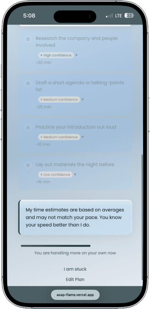
Break the goal into steps. Every step carries a confidence level.
- 4
Clarify or stop
Coach when someone is stuck. Stop once there’s a clear next step, and say plainly when a request is out of scope.
Building with real AI
Testing the real AI exposed problems we couldn’t see in static screens.
Once the prototype was connected to the Claude API, we could see how the experience behaved with different inputs.
That surfaced a few issues we needed to address.
Recommendations were too similar.
Different scenarios could produce similar recommendations.
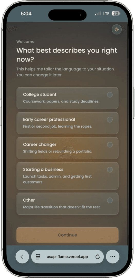
Added role- and context-specific inputs to the prompt structure so recommendations could better reflect different scenarios.
We expanded the prompt inputs to include the user’s role, goal, and relevant task context, helping the AI distinguish between scenarios instead of relying on generic task steps.
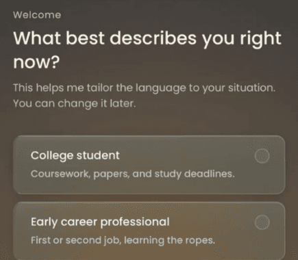
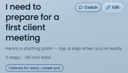
The role chosen on the first screen, and the plan it shapes — tagged “Tailored for early-career pro.” Some responses were unreliable.
Some interactions stalled or failed to return a useful response.
Refined prompt constraints and response handling to make outputs more predictable when responses were delayed or incomplete.
We refined the instructions that bounded the AI’s response and clarified how the prototype handled incomplete, delayed, or unhelpful outputs. This made the interaction more predictable and helped surface failures during testing.
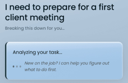
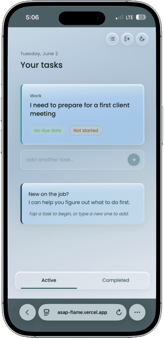
While the AI is working, the screen says so — “Analyzing your task…” — instead of sitting empty. Users lost track of progress.
It wasn’t always obvious where users were in the planning flow.
Added clearer step and next-action cues so users could see where they were in the plan at a glance.
We made the plan’s current step and upcoming actions easier to identify, using clearer progression cues and presenting next steps in a more structured sequence.
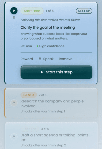
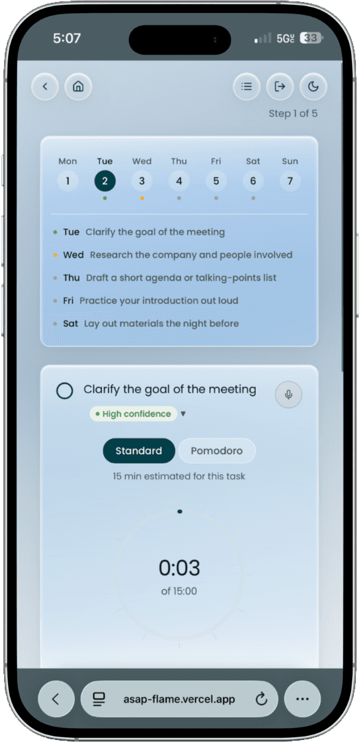
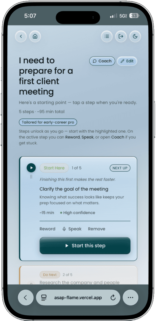
Each step shows its place — “1 of 5” — and later steps stay locked until the one before is finished.
Validation
What we learned from using it with people.
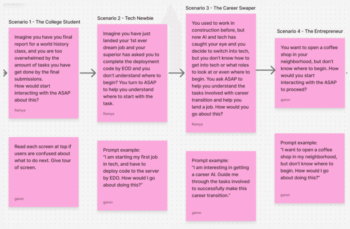
We ran 6 user interviews and 4 usability scenarios across 3 design iterations using a live AI-powered prototype.
- User interviews
- 6
- Usability scenarios
- 4
- Design iterations
- 3
- Functional AI prototype
- 1
What we found
The step-by-step model made the product easier to approach.
Users responded well to having a smaller action in front of them instead of a long list.
Confidence cues helped set expectations.
Users had a better sense of how much weight to put on an AI recommendation when the system communicated confidence.
The experience felt lighter when users could focus.
Showing one action at a time reduced the feeling of having to manage everything at once.
Impact
We ended with a clearer model for AI-guided planning.
ASAP addresses the gap between having a goal and knowing how to achieve it. By clarifying goals and guiding tasks with AI, the app makes complex work easier to navigate.
User testing surfaced challenges with generic recommendations, unclear response timing, and limited visibility into task progress. Those findings informed improvements in personalization, response behavior, and task progression.
Personalization
Role and task context feed the prompt, so a plan can reflect who it’s for and what they’re facing.
Response behavior
Tighter prompt constraints and clearer handling of slow or incomplete responses made the interaction more predictable.
Task progression
Step counters, a highlighted next step, and locked future steps show where you are in the plan.
My role
I worked on the experience between the user’s goal and the AI’s response.
On a four-person team, I focused on the parts of the product that shaped how users interacted with the AI.
- UX research and usability testing
- Conversation design
- Prompt architecture
- AI behavior and response patterns
- Information architecture
- Confidence and limitation states
- Onboarding and product copy
- Iterative prototyping
- Translating research findings into product decisions
HCI capstone, DePaul University.
Design system
Calm by default, so the task stays dominant.
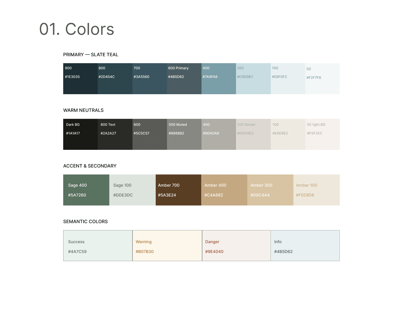
A slate-teal core with warm neutrals, sage and amber accents, and a restrained semantic set — enough structure to keep AI states legible without letting the interface turn decorative.
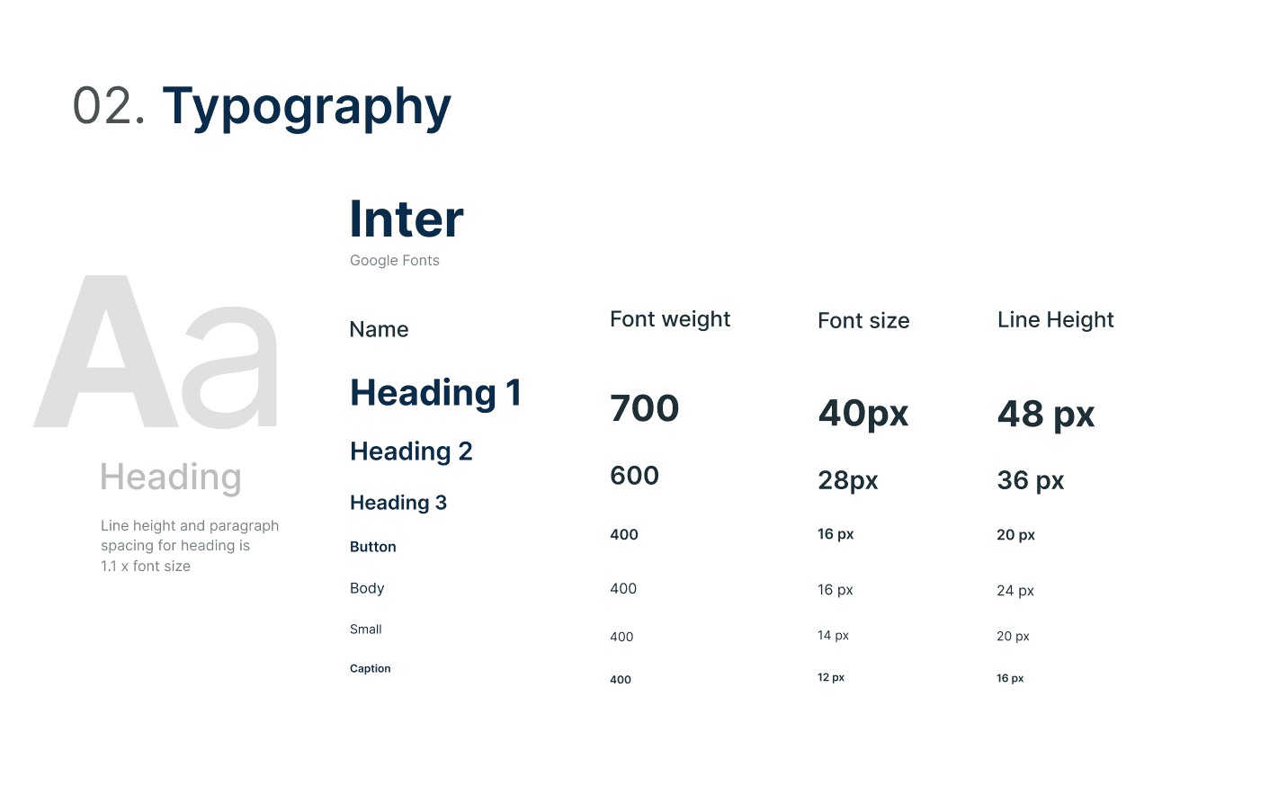
Weight carries hierarchy rather than colour, and amber is reserved for selection and guidance so a recommendation never competes with the step in front of you.
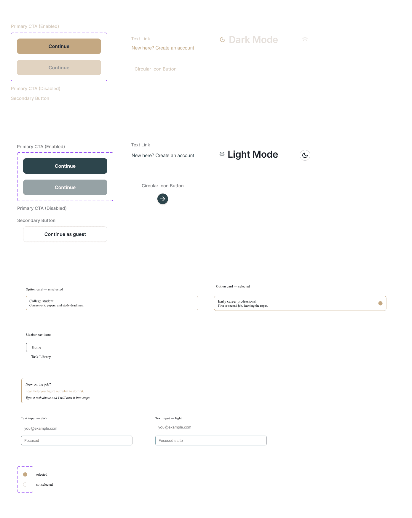
Never
Neon AI gradients, unrelated brand colours, colour as the only indicator of state, or decoration that doesn’t support the task.
What’s next
The next step is making ASAP useful beyond the prototype.
The current experience works as a focused planning tool. The next version would need to handle more complex goals, connect to the tools people already use, and prove that the guidance actually helps people follow through.
Handle more complexity
Adapt the planning experience to different types and sizes of goals.
Work with existing tools
Connect planning to calendars, notes, and other everyday workflows.
Prove the value
Measure whether users actually complete more of what they set out to do.
Final thoughts
Good AI design isn’t about doing everything for people.
For ASAP, the better experience was one that helped people make the next decision themselves.
PM Dashboard