PM
Dashboard
A Power BI reporting tool that gave six Portfolio Managers at Mainstreet Advisors a real-time, single-screen view of their AUA, client health, and revenue — replacing hours of manual Excel work with an instant overview.
- Company
- Mainstreet Advisors
- My Role
- Data Analyst Intern
- Tools
- Power BI · Excel · DAX
- Timeline
- 8 weeks · Internship
- Scope
- 6 Portfolio Managers

Final dashboard delivered in Power BI · all figures are illustrative dummy data
At a Glance
What role are you targeting?
Product Designer with data fluency
Roles bridging UX and BI in financial or enterprise contexts.
Is your work relevant to that role?
Stakeholder-driven BI design
Built from PM interviews to solve a real daily problem for 6 Portfolio Managers overseeing $1B+ AUA.
Can I quickly understand your contribution?
Sole UX & BI Designer
I interviewed all 6 PMs, synthesized their mental models, and delivered the live Power BI dashboard.
Is there evidence of thinking, not just polish?
Research found 3 conflicting mental models
Dashboard hierarchy resolves all three in a single view — that insight is the design.
Do outcomes look credible?
Live and used daily
Dashboard deployed internally at Mainstreet Advisors, in active use by the portfolio management team.
The Problem
Six managers.
Zero unified view.
Mainstreet Advisors managed over $1.2B in assets under advisement across six Portfolio Managers. Each PM tracked their own book of business through a patchwork of Excel files, email threads, and manual lookups into the core CRM. There was no shared reporting standard, no live view of account health, and no way for a PM to know — at a glance — how their portfolio was performing against prior periods.
$1.2B
Assets under advisement
3–4 hrs
Lost every week, per PM
6
Portfolio Managers, zero shared view
Every Monday morning I'm pulling three spreadsheets, cross-referencing account lists, and manually calculating growth. By the time I have the numbers, half the day is gone.
Time lost weekly
PMs spent 3–4 hours every week stitching together a manual picture of their book from disconnected sources.
No standard view
Each PM had a different way of tracking growth, AUA, and run rate — making cross-team reviews inconsistent and slow.
Stale data
Spreadsheets were updated manually, sometimes days late — meaning decisions were made on numbers that didn't reflect current reality.
How might we give each Portfolio Manager a single, live screen that replaces their Monday morning spreadsheet ritual?
Research · PM Interviews
4 of 6 PMs said the same thing.
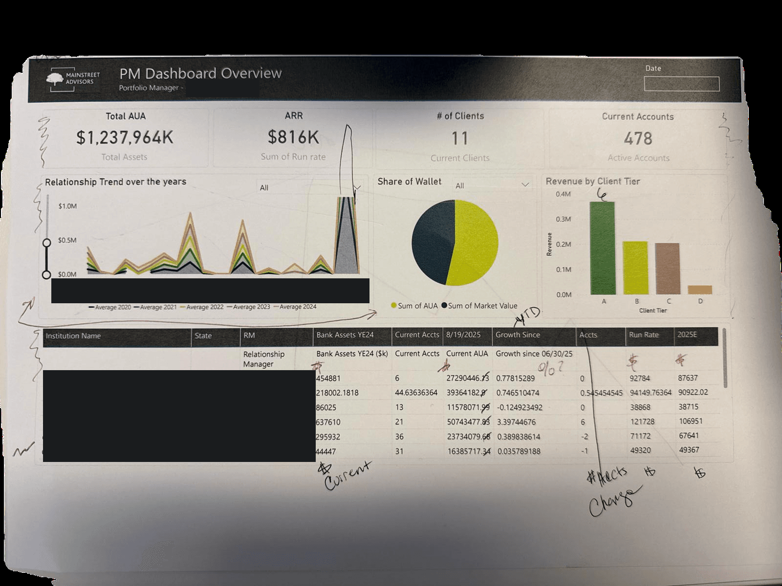
Before building anything, I interviewed all 6 Portfolio Managers to understand their actual workflow. Their existing process: manually pulling daily updates from multiple Excel sheets — described as tedious, with figures easy to miss because everything lived in a single undifferentiated spreadsheet.
The numbers are all there, but they're jumbled together. I wish I could see my progress in a structured, organized way — not just a wall of cells.
Key finding
4 of 6 PMs independently said they wished they could see their progress in a structured, organized way. This was the finding that justified building the dashboard.
Workflow pain
Every PM's daily update ritual started with Excel — pulling data manually, cross-referencing sheets, and doing calculations by hand before they could make a single portfolio decision.
The gap
Numbers weren't missing — they were buried. The problem was structure and visibility, not data availability. That distinction shaped every design decision.
Process
From raw Excel to live Power BI
The project ran across four phases — from understanding what PMs actually needed to see, through data wrangling, design iteration, and final delivery.
Discovery
Interviewed 4 of the 6 PMs to map their weekly reporting ritual. Identified the 6 core metrics they returned to most: AUA, ARR, # clients, account count, wallet share, and growth since last quarter.
Data Pipeline
Extracted raw data from multiple Excel workbooks and the internal CRM. Cleaned, normalised, and structured it into a relational model in Power BI using DAX calculated columns and measures.
Design Iterations
Built 3 layout iterations with PM feedback after each round. Key tension: information density vs. at-a-glance readability. Early versions were too table-heavy; final version led with KPI tiles and visuals.
Delivery
Delivered 6 personalised dashboards — one per PM — filtered to their own book. Conducted a 30-minute walkthrough with each manager and incorporated final feedback before handoff.
Design Rationale
Every decision came from the PMs.
Tool choice, layout order, color-coding — each was grounded in what the interviews revealed about how PMs actually think through their portfolios.
Why Power BI
Why Power BI
Power BI was chosen because it integrates directly with Excel inside Mainstreet's existing Microsoft environment. The PMs already lived in Excel — the tool decision was grounded in their actual workflow, not a default preference.
Why the existing design system
The dashboard followed Mainstreet's brand colors, typeface, and sizing conventions. Familiarity lowered adoption friction — PMs didn't need to learn a new visual language to trust the numbers.
Why narrative order
Why narrative order
Charts were color-coded and sequenced to match how a PM actually reviews their book: headline AUA first, then trend context, then wallet positioning, then revenue breakdown, then client-level detail. Not all metrics uniformly.
Why 6 filtered views
Each PM sees only their own book. One shared dashboard with cross-PM data would have created noise and comparison anxiety. Individual filtered views came directly from the interview finding: PMs wanted to track their own progress, not rank against peers.
The Solution
Every section earns its place
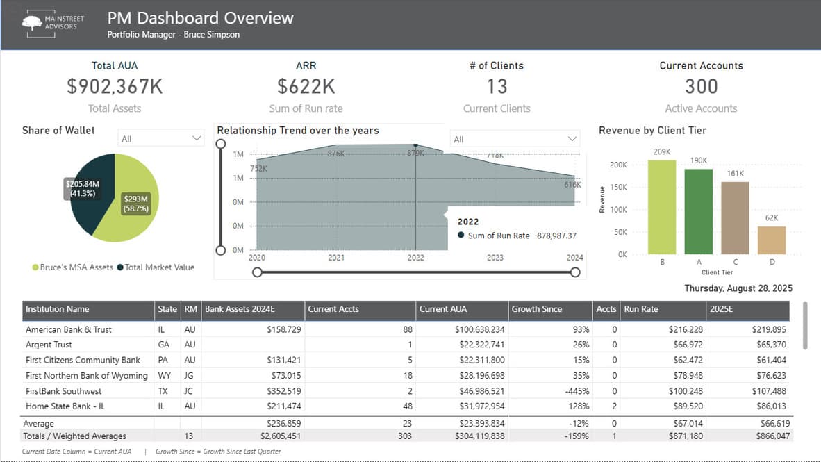
The layout follows a top-to-bottom information hierarchy: headline numbers → trend context → wallet positioning → revenue breakdown → client-level detail.

$902,367K
Total AUA
Total Assets
$622K
ARR
Sum of Run Rate
58.7%
Share of Wallet
Bruce's MSA Assets
$209K
Revenue — Tier B
Highest client tier
13
# of Clients
Current Clients
Trend Context — Relationship Trend
Immediately after the headline tiles, the trend chart answers the next question a PM has: is this book growing or shrinking? Wallet share sits beside it — the same visual weight, because both questions get asked in the same breath during a review.
Client-Level Detail — The Table
The table is deliberately last. It's where a PM goes to investigate a number the tiles and charts surfaced — not where they start. Growth percentages are color-coded green/red so outliers are visible without reading every row.
Before & After
What changed for the PMs
Before — Manual Excel Workflow
- ✗3–4 hours every Monday morning gathering and cross-referencing data
- ✗No single view — at least 3 spreadsheets open simultaneously
- ✗Data was days old by the time it was compiled
- ✗Each PM used a different format — no cross-team consistency
- ✗Growth calculations done by hand, prone to formula errors
- ✗No visual context — everything in raw numbers
After — Power BI Dashboard
- ✓Full portfolio picture available in under 10 seconds on load
- ✓One screen: KPIs, trend charts, wallet share, and client table
- ✓Live data connected to source — always reflects current state
- ✓Standardised format across all 6 PMs — consistent review meetings
- ✓DAX-calculated growth rates — no manual formulas, no errors
- ✓Visual hierarchy guides attention: tiles → charts → detail table
Design Decisions
Why it looks the way it does
Every layout and colour choice was constrained by two things: Mainstreet Advisors brand guidelines and what PMs said they needed to trust on sight.
Colour System
Brand greens, not generic blues
Mainstreet Advisors' brand palette centres on earthy greens and tans — forest green for primary data, olive for secondary, tan for tertiary tiers. This made the dashboard immediately feel like an internal tool, not a generic BI template, and helped PMs orient quickly by tier.
Layout Hierarchy
Headline numbers before charts
Early iterations buried the KPI tiles midway down the page. PM feedback was clear: "I need to see my total AUA the moment I open this." The final layout puts four headline tiles at the very top — Total AUA, ARR, # Clients, Active Accounts — before any visualisation.
Number Format
No decimals, dollar signs everywhere
Stakeholder feedback on early iterations specifically called out inconsistent formatting — some figures had decimals, some didn't; dollar signs appeared in some columns but not others. The final version enforces a strict format: whole dollar figures with $ prefix, growth as clean percentages, no trailing zeros.
Personalisation
One dashboard per PM, not a shared view
Rather than a single all-PM dashboard with filters, each PM received their own report page scoped to their book. This eliminated the risk of accidentally viewing another manager's data and made the dashboard feel like a personal tool rather than a shared report.
Impact
Results that mattered
6
Portfolio Managers
Each received a personalised dashboard scoped to their own book of business
~3h
Saved per week, per PM
Manual Monday reporting ritual replaced with a live, instant-load overview
1
Screen for the whole picture
KPIs, trends, wallet share, revenue tiers, and client-level detail — all visible at once
Reflection
What I learned building this
Stakeholder-first design
The biggest design decisions were driven by PM feedback, not my instincts. What looked clean to me felt unfamiliar to them. Showing iterations early and often — not a polished final — was what made the feedback loop actually work.
Data quality is design work
Half the project was cleaning and structuring raw Excel data before a single visual was built. Inconsistent column naming, merged cells, and missing values are design problems — they define what's possible downstream. I learned to treat data modelling as UX work.
Constraints sharpen decisions
Working within Mainstreet's brand guidelines — rather than against them — produced a more cohesive result than if I'd had total creative freedom. The constraint of "use these greens" pushed me to think about hierarchy and typography instead of leaning on colour.
AI as a build partner
This was my first time connecting Excel to Power BI, and I leaned on AI tools throughout — to debug Power Query refresh errors, write and explain DAX measures, and walk me through setting up live data connections instead of static imports. It compressed a steep learning curve into something I could troubleshoot in real time, while I stayed responsible for the data modelling and design decisions.
One screen. Six managers. Zero spreadsheets.