Case Study · HCI Capstone · DePaul University

ASAPAI-Scaffolded Action Planner

An AI-native mobile app that helps people navigating major life transitions break down overwhelming tasks — one step at a time — acting as a coach, not an assistant.

Live with real AI integration · Iteration 2 in progress
Team4 Members
My RoleResearch Lead · UX Design
ToolsFigma · Claude · Cursor · Perplexity · Anara
StatusPost Round 1 Testing · Pre-deployment
ASAP light mode - home screen
Light mode — home screen
ASAP dark mode - home screen
Dark mode — home screen
6+
Design Research Interviews
4
Usability Test Scenarios
3
Fidelity Levels Lo to Hi
2
Modes Dark & Light
100%
Real AI Integration at Hi-Fi
✦ 01 · Problem ✦
01 · Problem

The paralysis
of starting over.

Whether it's starting college, switching careers, or launching a business — major transitions dump an entirely new set of tasks on people who don't yet know how to handle them. The result: overwhelm, avoidance, and stagnation.

"The problem isn't motivation — it's scaffolding. People know they have things to do. They don't know how to start, sequence, or break them down without help."

Core research insight
🌀
The Gap
Existing tools either dump tasks on users or complete them entirely. Neither builds independent planning skills.
😶
The Moment
The blank screen moment is the biggest barrier. Users freeze before they type a single word.
🎯
The Goal
ASAP fills this gap: coach, not complete. Guide users through their own thinking — don't think for them.
✦ 02 · My Role ✦
02 · My Role

Research lead
& UX director.

I led user research end-to-end — literature review, design research interviews, usability testing — and translated findings into design direction. I directed the IA and screen flow, drove the color system for both modes, and kept every decision grounded in what participants actually said.

Literature ReviewDesign Research Interviews Usability TestingIA & Screen Flow Color SystemFeature Prioritization
✦ 03 · Design Process ✦
03 · Design Process

Six phases,
two full cycles.

A structured double-diamond process with two planned usability testing rounds. Round 2 is scheduled post-deployment to test with real usage context.

01
✓ Complete
Problem Definition
Literature review, competitive analysis, problem framing
02
✓ Complete
Early Ideation
Lo-fi wireframes, screen flows, AI-assisted initial output via Figma Make
03
✓ Complete
Round 1 Testing
6 participants, 4 scenarios, happy path mapping
04
✓ Complete
First Iteration
Mid-fi to hi-fi with real Claude API integration, dark + light mode
05
→ Up next
Deployment
App goes live before Round 2 to capture real-use patterns
06
→ Planned
Round 2 Testing
Post-deployment iteration based on real usage findings
Lo-fi Wireframes — Phase 02

Initial lo-fi explorations. Three rounds of lo-fi built the foundation: where core actions live, how the AI coaching flow is triggered, and what information the user needs at each step.

ASAP lo-fi wireframes round 1 — first screen explorations
Lo-fi round 1 — first screen explorations, task entry and breakdown views
ASAP lo-fi wireframes round 2 — refined flows
Lo-fi round 2 — refined flows, AI coaching interaction patterns emerging
ASAP lo-fi wireframes round 3 — pre-testing refinement
Lo-fi round 3 — pre-testing refinement, happy path mapped end-to-end
Mid-fi Wireframes — Bridge to Hi-Fi

Mid-fidelity added structure and hierarchy. This is where visual language was established — spacing, component placement, and the information architecture that carried through to the final hi-fi build.

ASAP mid-fi wireframes — structure and visual hierarchy
Mid-fi wireframes — visual structure, component hierarchy, and information architecture
Happy Path — Core User Journey

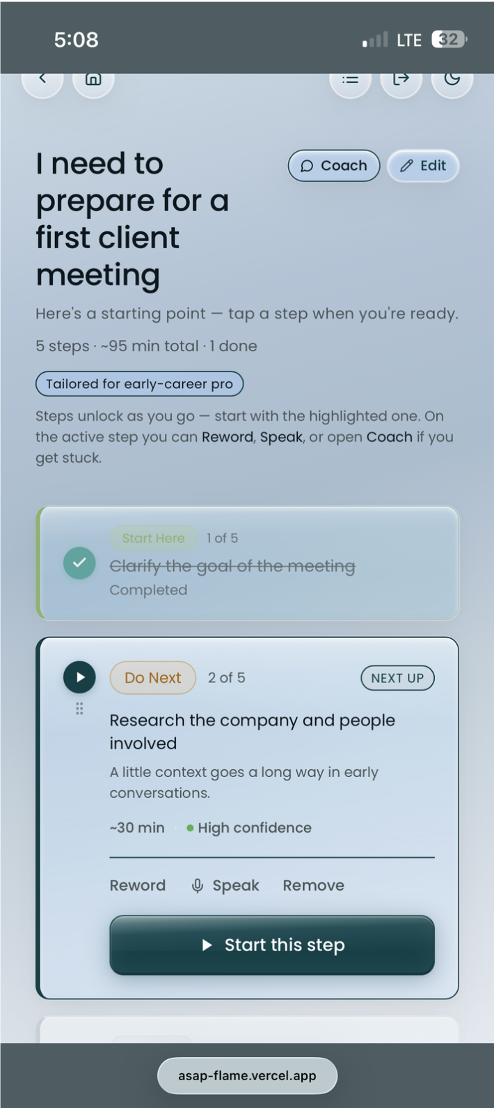
The happy path maps the ideal flow from first open to a completed, AI-broken-down action plan — with the clarification and coaching steps visible.

ASAP happy path — complete user journey from input to action plan
Happy path — from first task input to AI-generated, structured action plan
Team Alignment Activity
ASAP in-class design alignment activity
In-class alignment activity — collaborative problem framing and feature prioritisation
✦ 04 · User Research ✦
04 · User Research

Who we
designed for.

6 design research interviews with participants aged 18-34, each currently or recently navigating a major life transition. Four scenarios shaped the entire design: College Student, Tech Newbie, Career Swapper, Entrepreneur.

"Users didn't lack ambition — they lacked a clear first step. The blank screen moment was the biggest barrier to action."

Key research finding

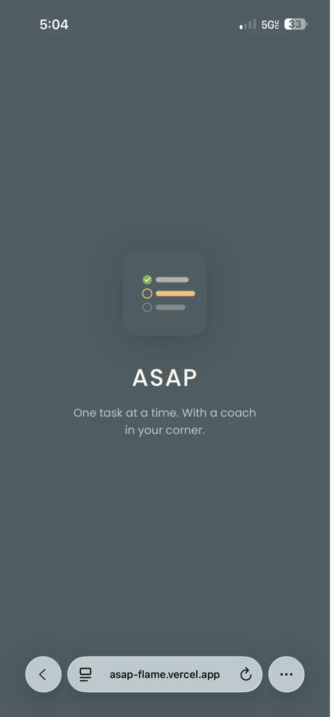
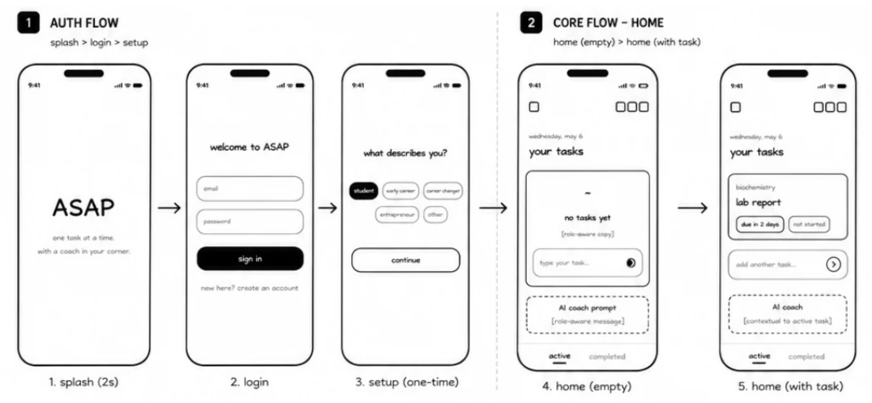
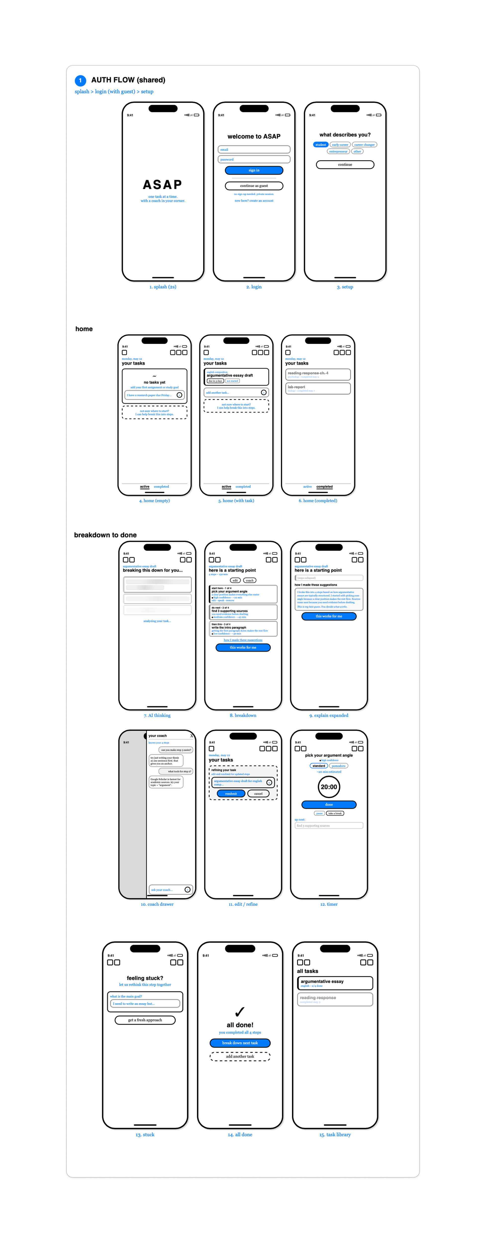
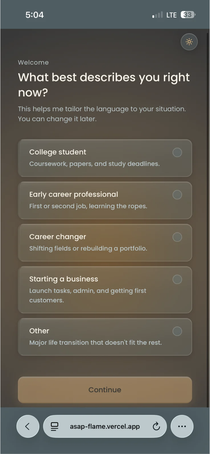
Onboarding Flow — What users see first

The onboarding was designed to immediately signal the app's purpose: scaffolded guidance, not another to-do list. Users enter their transition type before the AI can personalise its coaching responses.

ASAP screen 2 — onboarding light
Onboarding — light
ASAP screen 2 — onboarding dark
Onboarding — dark
Literature Review
Method
Established research foundation for AI scaffolding in executive function support and task management for transitioning adults.
Competitive Analysis
Method
Benchmarked against Todoist, Notion AI, and general-purpose LLMs — identified the coaching gap none of them filled.
Design Interviews
Method
6 participants across 4 transition types. Surfaced emotional triggers — paralysis, shame, overwhelm — alongside practical friction points.
Persona Development
Method
Built from real interview findings, not assumptions — to keep design decisions grounded throughout the project.
✦ 05 · AI in Our Process ✦
05 · AI in Our Process

Where AI helped —
and where it didn't.

AI was embedded in how we designed and built it. An honest account of what worked and what fell short.

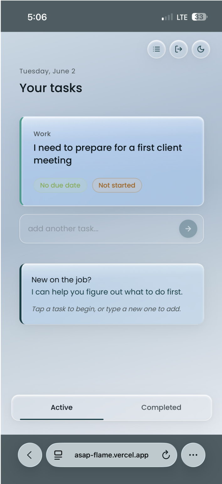
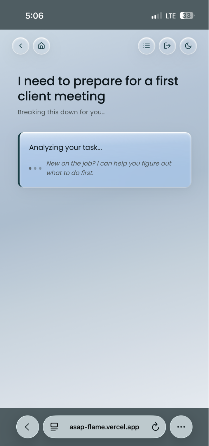
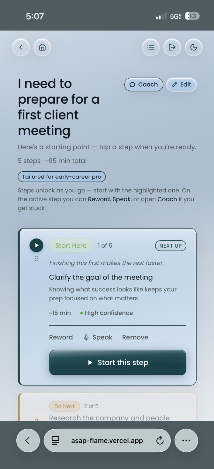
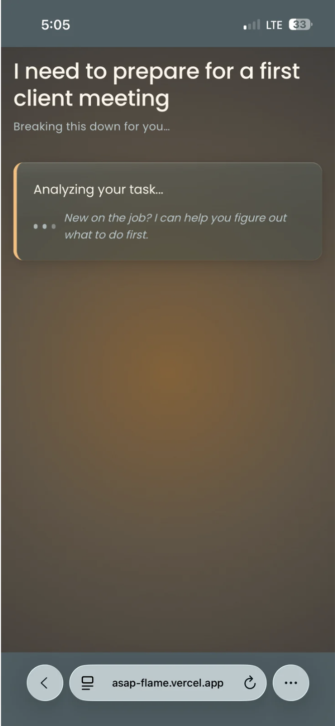
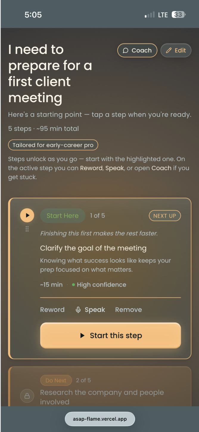
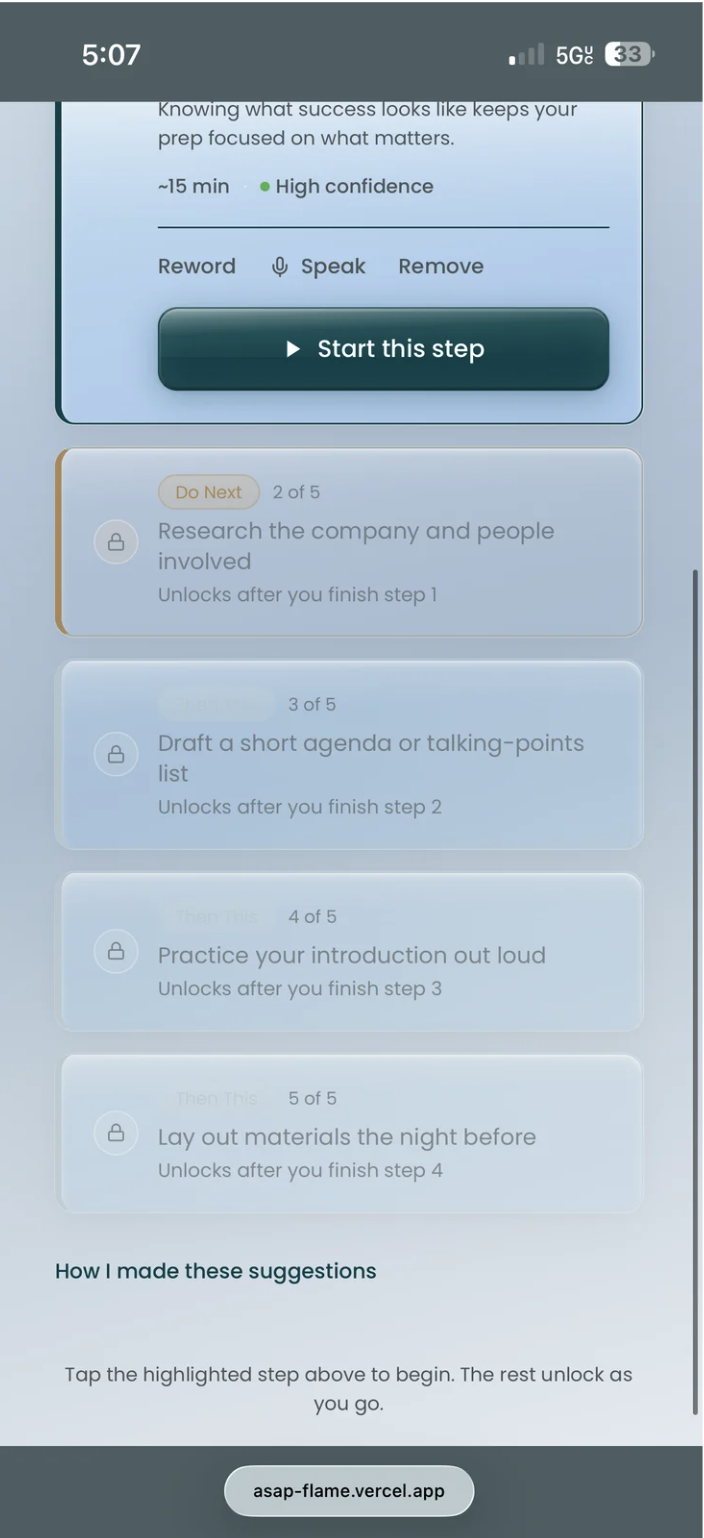
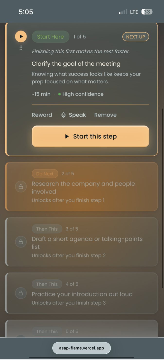
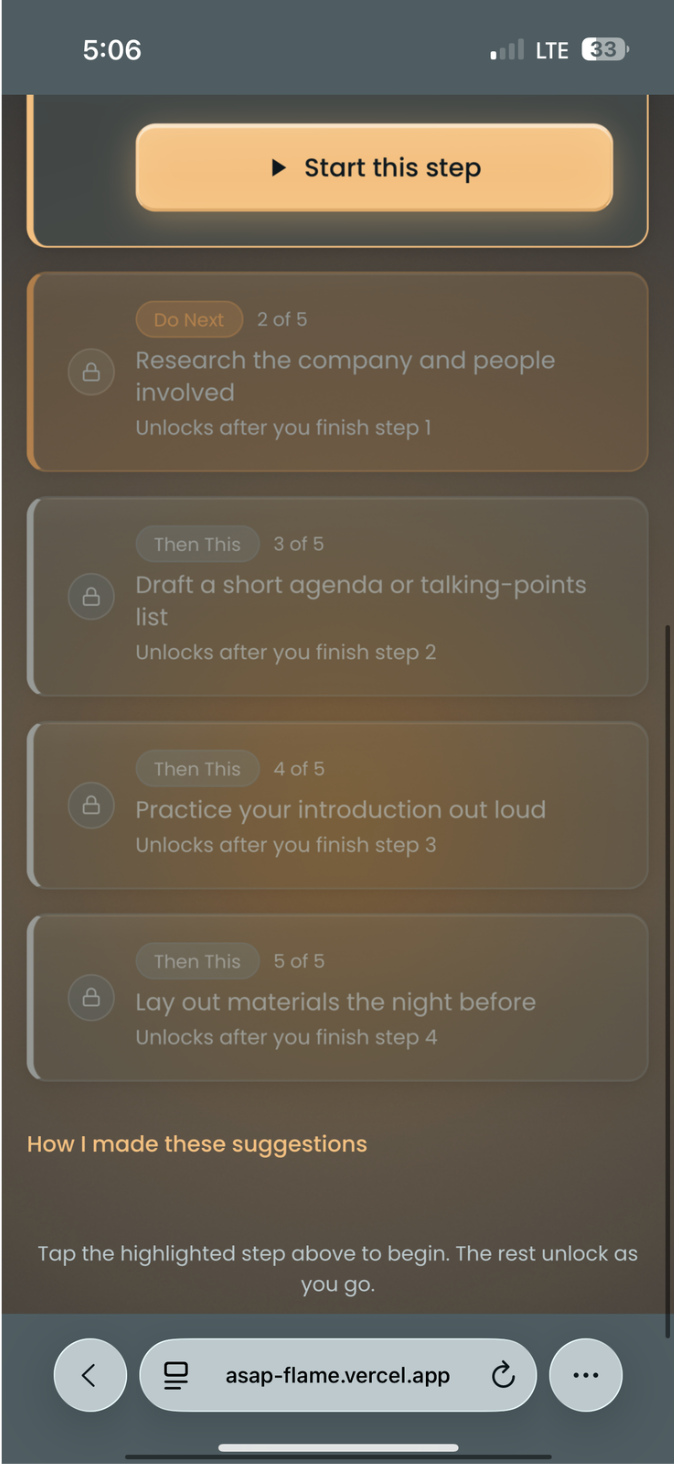
Task Entry — Where coaching begins

The task input screen is intentionally minimal. The AI doesn't act immediately — it first asks a clarifying question to understand the user's context before breaking down the task. This was a direct research finding: users felt heard before being guided.

ASAP screen 3 — task input light
Task input — light
ASAP screen 3 — task input dark
Task input — dark
Figma Make
Initial wireframe generation
Fast starting point for early flows. Needed significant rework — lacked nuance but unlocked team alignment quickly.
Perplexity + Anara
Research synthesis
Useful for scanning literature quickly. Saved hours in the literature review phase. Citations needed manual verification.
Claude + Cursor
Hi-fi build + AI integration
The hi-fi prototype is live with real Claude API integration for task breakdown and coaching. Biggest technical unlock of the project.

"AI accelerated ideation and build speed significantly. It struggled with context-depth — the same gap we identified in the product itself."

Honest assessment — generic AI output required heavy human curation at every stage
✦ 06 · Design System ✦
06 · Design System

Calm
by design.

The core principle: the app must not add to the noise. Users are already overwhelmed. Every decision — color, type, layout — reduces cognitive load.

🎨
Color
Slate Teal Primary
Grounded, non-stimulating palette. Warm neutrals with earthy sage and amber accents. Built for both light and dark modes.
Aa
Type
Inter Throughout
Clean, accessible, readable across screen sizes without visual weight. Lets users focus on the task, not the interface.
Buttons
Neutral & Unambiguous
No unnecessary flair. Users always know what to tap next without thinking. Less friction, more flow.

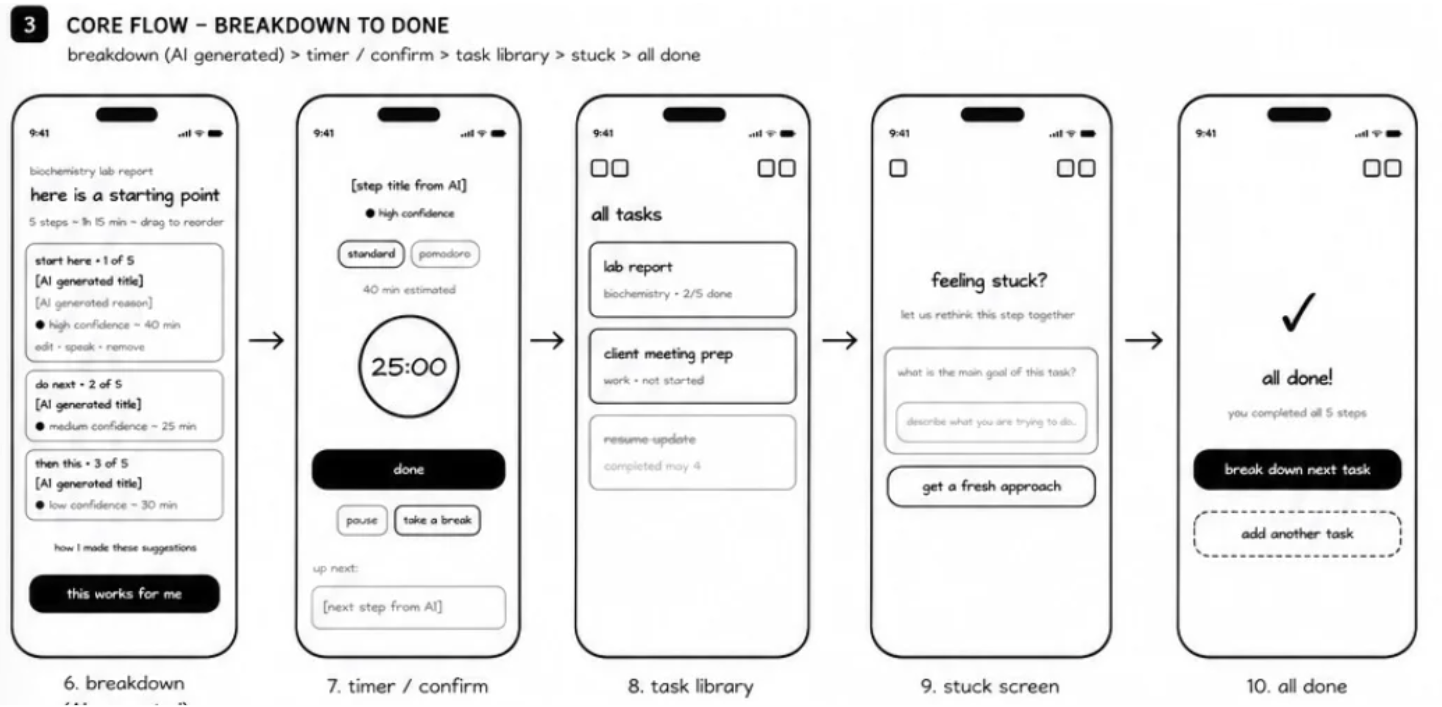
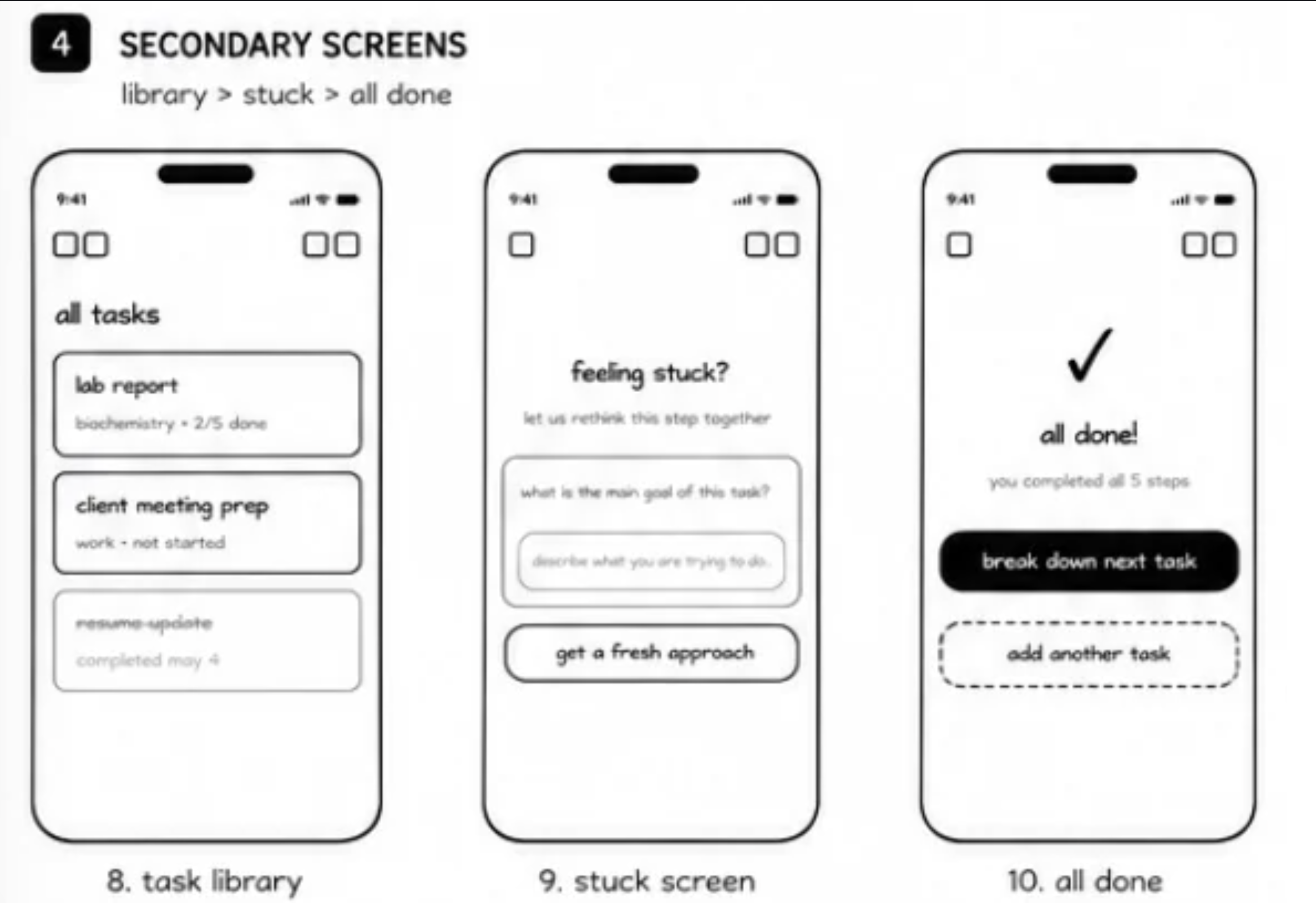
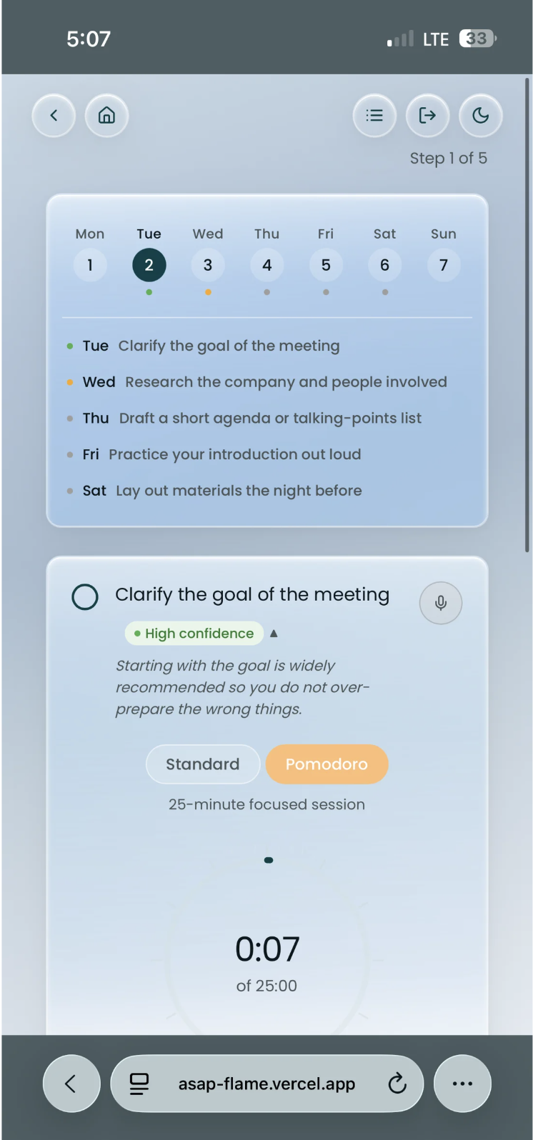
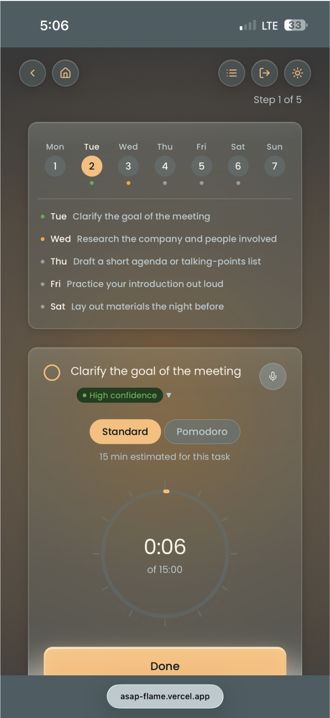
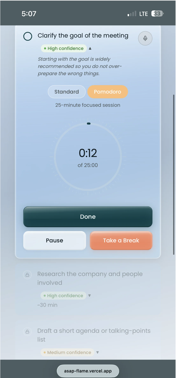
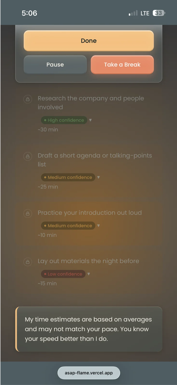
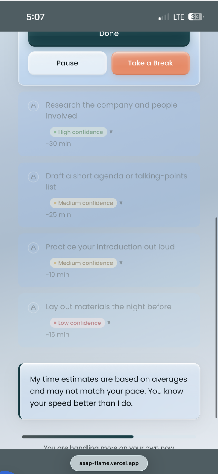
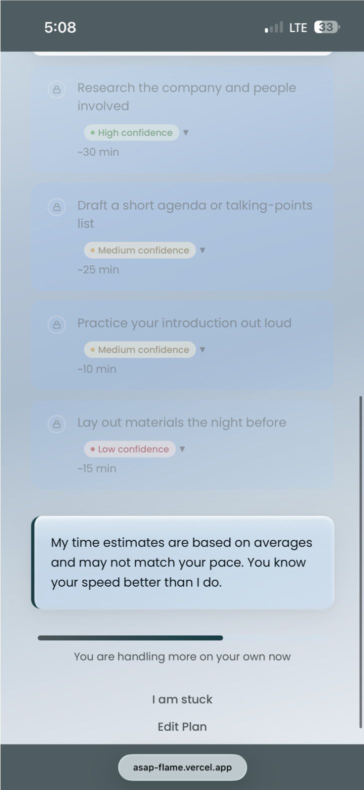
AI Breakdown — Screen 4

The first AI response screen shows the broken-down task with confidence labels. The calm design language prevents the screen from feeling overwhelming — intentional use of whitespace, muted secondary text, and a single primary action.

ASAP screen 4 — AI breakdown light
AI breakdown — light
ASAP screen 4 — AI breakdown dark
AI breakdown — dark

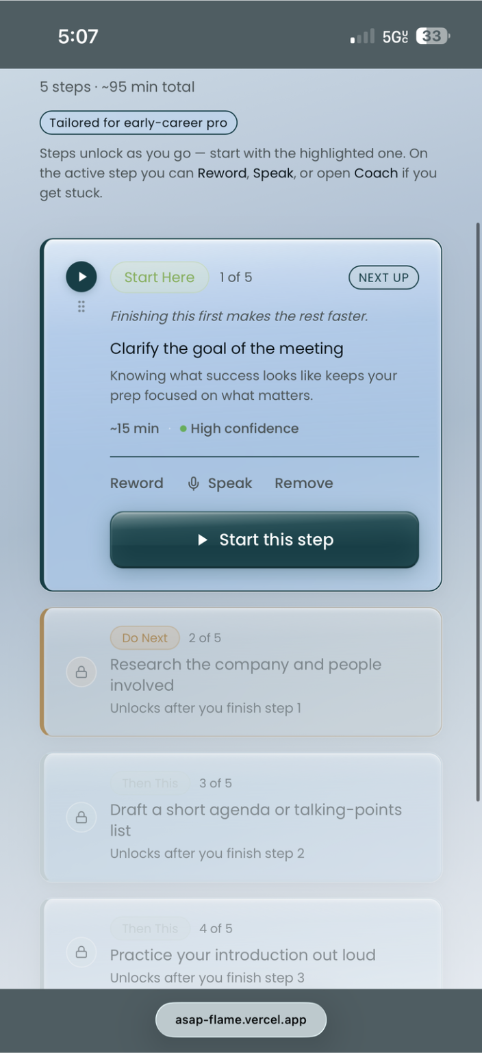
Subtask Detail — Screen 5

Subtask detail view. Each step is presented one at a time to prevent re-triggering the blank screen effect. The coaching nudge appears contextually — not on every screen.

ASAP screen 5 — subtask detail light
Subtask detail — light
ASAP screen 5 — subtask detail dark
Subtask detail — dark

Progress View — Screen 6

Progress tracking. The design uses a minimal progress indicator — not a gamified streak — to avoid creating anxiety around incomplete tasks. The goal is momentum, not pressure.

ASAP screen 6 — progress light
Progress — light
ASAP screen 6 — progress dark
Progress — dark

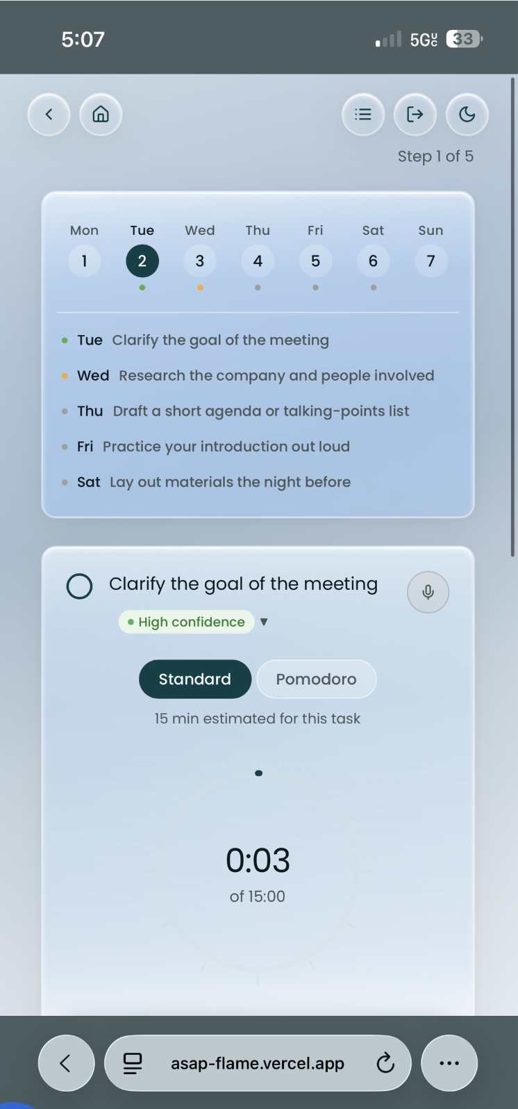
Deep Focus Mode — Screen 7

Deep Focus is a distraction-free view for users who want to work through a single task without switching between screens. Calendar access is intentionally housed here — a Round 1 finding: users wanted it earlier in the flow. Iteration 2 will surface it sooner.

ASAP screen 7 — deep focus light
Deep Focus — light
ASAP screen 7 — deep focus dark
Deep Focus — dark

Profile + Settings — Screen 8

Profile and settings. Transition type is stored here — a key input for personalising the AI's coaching responses. In Iteration 2, this will inform contextual memory across sessions.

ASAP screen 8 — profile light
Profile — light
ASAP screen 8 — profile dark
Profile — dark
Additional Screens — 9 to 11

Remaining light-mode screens covering edge cases, empty states, and the onboarding completion flow.

ASAP screen 9
Screen 9
ASAP screen 10
Screen 10
ASAP screen 11
Screen 11
Figma Design System Overview
ASAP Figma component library and screen overview
Figma — component library, design tokens, and full screen set
✦ 07 · Usability Findings ✦
07 · Usability Findings

What Round 1
testing revealed.

Participants spanned all four transition types. A product with a strong emotional foundation but significant functional gaps limiting real-world adoption.

"ASAP's voice is its superpower. Its intelligence depth is its ceiling."

Core tension identified — next iteration must close the gap between emotional resonance and real-world utility
✓ What worked
  • Warm, honest tone — didn't feel generic or robotic
  • Confidence labels felt refreshingly different from other AI tools
  • One-step-at-a-time pattern helped users who freeze at blank screens
  • Clarification flow caught vague inputs — called a "hidden gem" by one participant
  • Welcome copy that acknowledged life transitions resonated emotionally
  • Soft refusal and coach fallback responses felt supportive, not dismissive
✗ What didn't
  • Subtasks too surface-level — all personas got roughly the same output
  • 5 steps insufficient for multi-day or complex projects
  • No due date functionality breaks the planning loop
  • Clarification flow powerful but hidden — users didn't know it existed
  • No onboarding tutorial before the first task
  • Edit button ambiguous; no save progress indicator
  • Calendar only accessible in Deep Focus — users wanted it earlier
✦ 08 · What's Next ✦
08 · What's Next

Iteration 2
roadmap.

Deployed before Round 2 testing — intentionally. Real usage data will surface friction that controlled testing can't capture.

01
Deeper subtask personalisation — role-aware breakdowns that adapt to context, not canned outputs
02
Contextual memory — remember transition type and build on previous sessions
03
Due date functionality + calendar integration — close the planning loop
04
Onboarding tutorial — surface the clarification flow and confidence labels on first use
05
Sub-role granularity — engineer vs. nurse vs. sales rep need meaningfully different scaffolding
06
Round 2 usability testing post-deployment to validate iteration decisions
Takeaway

Building the coach, not the answer. A tool that does everything for you isn't scaffolding — it's dependency. The goal was always to make itself unnecessary. That's still the north star.

UX ResearchAI-Native DesignMobile UX Usability TestingEdTechExecutive Function
← Home Raahi →